Here is my 2nd page with the We Scrap North Shore kit, the picture was on my eldest's birthday and 'cos it was quite dark and inside I edited it in some photo software and then made it black and white.
The inspiration is an eclectic mix for this page - I have seen the little stitch patches on the sides of pages lots, and I love the stitched through letter look as well as kraft doilies, so I just wanted to have a go at all of that!
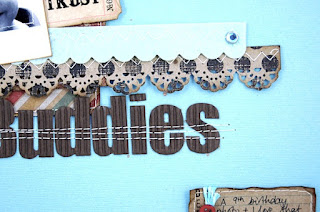
To make the page I dug out some of my Christmas presents for this page which include the Spellbinders iron works die, some gorgeous doily type shapes which I have also seen used on Christmas cards to (so got to remember that for next year). So I made some kraft doilies and inked around the edges with distress ink too. My other Christmas present was the the ek success abstract flower punch which I used on a strip below the photo. I started by mounting my picture on some white card to make it more polaroidish and then stitched around the photo and inked the edge. I layered up some squares of the paper, stitching and inking the edges as I went. I made a little journal block out of the lined MME paper and wrapped it in twine, then added some of the tags and flags, ribbon and bunting, stitching bits as I went. I also added some strips of stitching at either corner of the page and then finished it off with some flicks of Antique Copper Glimmer mist. The title is jillibean soup corrugated card and I added a few rows of stitching through that too (so a thoroughly stitched page for this one :))
And in other exciting news I have been asked to join the Studio Challenge Blog design team, which has bi-monthly sketch and themed challenges, my first page for this will be up on the 19th February. It is a great group of creative ladies to be a part of so I am really excited.


really great layout. congrats on your new adventure.
ReplyDeleteGreat layout! Love how you layered the picture and the stitching. Nice touch!
ReplyDeleteGorgeous!! I love this blue background, I'm not sure I'd dare to use such a bold colour!!! But wow...
ReplyDeleteI love the stitching, I wish I could do that but I don't have patience for a sewing machine. I like the colors with the black and white photo.
ReplyDeleteThat's so cute! Love all the layering and the photo came out great. :)
ReplyDeletegreat job!!!
ReplyDeleteCongrats on the DT! Nice page! Love the stitching through your title letters!
ReplyDeleteSweet layout! Very cute!!
ReplyDeletelove that page and congrats!!!
ReplyDeleteAnother super page. I love the blue its very bright and sets the brown embelishments lace etc off beautifully. I also like the black and white photo. I'm very partial to black and white photos, but never have used them in my scrap books, dont know why though.
ReplyDeleteBeautiful details! Congratulations on your news - it is much deserved!
ReplyDeleteWhat a sweet photo. Love what you did with this layout.
ReplyDeleteI truly love the stiching over the word buddies.. i'm goingto pull out my sewing machine and try that.. i love he looks.. thanks for sharing...
ReplyDeleteBeautiful page! Love the blue color!
ReplyDeleteThose kraft elements are such a nice masculine touch. I love the stitched photo and then all the other types of stitching on the other elements really ties it all together.
ReplyDeleteHuge congrats to you ..... another truly stunning page
ReplyDeleteFabulous news Katherine!
ReplyDeleteSuper layout design and the effect of stitching across the title...
This layout is gorgeous. And what a precious photo!
ReplyDeleteCongrats on the DT!
Love the layering...and congrats on the DT!
ReplyDeleteAlison xx
Congrats on the DT :)
ReplyDeleteLove how you used doilies for a distinctly masculine looking page- great layout.
This is really pretty.
ReplyDeleteLove it.
C xx
Congrats on the DT.
ReplyDeleteI can see why they chose you, your layout is lovely