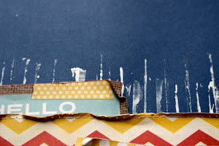
This is my first play with the lovely Simple Stories paper range, it has one of my favourite pieces of rainbow coloured chevron. I love all the hessian and denim in the papers which work well for boys and girls. I used the edge of the credit card I use for paint to make the stripes on the background and then layered up my papers which I stitched and distressed. I added a pocket behind the photo for my journalling and punched out some star confetti with my pound land punch. The title is also from Simple Stories, and to make the word nice stand out a little more I just went around the edge with a gel pen.
Thursday, 19 July 2012
It's Not Nice
This is my first play with the lovely Simple Stories paper range, it has one of my favourite pieces of rainbow coloured chevron. I love all the hessian and denim in the papers which work well for boys and girls. I used the edge of the credit card I use for paint to make the stripes on the background and then layered up my papers which I stitched and distressed. I added a pocket behind the photo for my journalling and punched out some star confetti with my pound land punch. The title is also from Simple Stories, and to make the word nice stand out a little more I just went around the edge with a gel pen.
Subscribe to:
Post Comments (Atom)


What a great story behind the photo and those paint stripes are so bold and original!
ReplyDeleteWhat a fabulous page,love the photo.xxx
ReplyDeleteA great read and your son looks a cutie. Loving the layout and all the different textures and effects.
ReplyDeleteHugs
Linda xxx
Great Layout - love that chevron paper
ReplyDeleteKate
xx
Oh I love the incorporation of paint and all those layers.. fabulous. Thanks for sharing.
ReplyDeleteLove it, its such a great page :-) Elaine -xxx- p.s please pop by and enter my fantastic ribbon candy :-)
ReplyDeleteThat photo is priceless! I love how expressive children can be. Great layout -- love the colors!
ReplyDeletethis is super cool- love the dripping paint!
ReplyDeleteLove how you did the painting. It does look like rain falling. The sprinkling of star confetti is fun too!
ReplyDeleteLOVE, LOVE, LOVE the paint stripes!!!! Great layout!
ReplyDeleteCUTE!! Love the confetti stars...and the story!! :D
ReplyDeletexErin
So amazing! I love those paint stripes. That solid blue background really makes the photo pop. I'm sure I've said so before but you do amazing work.
ReplyDeleteI love that the paint looks like rain-great layout!
ReplyDeletea fabulous page and great story
ReplyDeleteSuper story and fabulous layout. Some of those papers I wouldn't have thought to put together, but you made them really work! Love the white stripes you added in the background and it does look like rain especially against the blue. x
ReplyDeleteFab as usual. Love the paint, the deep blue paper and the multi-coloured stars.
ReplyDeleteFab page - love it :)
ReplyDeleteFab layout, this really made me smile, the photo is brilliant
ReplyDeleteLindsay xx
Gorgeous page. I love the painty lines against that deep blue background. Lovely texture with the edges of the paper too. xx
ReplyDeleteLove the background painting and what a face! Love that you captured that photo. Simple stories is a favorite of mine too! :)
ReplyDeleteI love that picture. The LO is brilliant
ReplyDelete